|
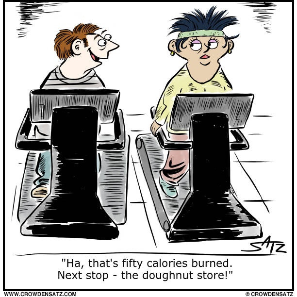
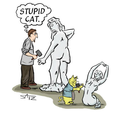
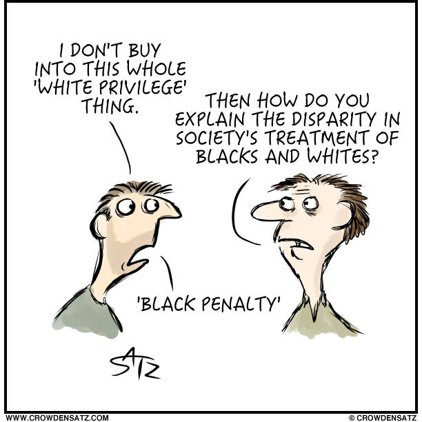
I was on the old computer yesterday and caught sight of this article: Why You Shouldn’t Exercise to Lose Weight, Explained With 60+ Studies I was SO sure I knew exactly what they'd be saying and ... I was correct. And by a crazy coincidence, the post I had scheduled for my Patreon patrons this morning was completely in keeping with the article - they could have used it as an illustration, no problem. So I'm a gonna repost it here, just because. AND later in the day, after my patrons have seen the 1:00 PM cartoon, I'll share that as well, it being also precisely the whole point of the article. And yet ... this cartoon predates that article by years and years. Your friendly cartoonist - ahead of his time.
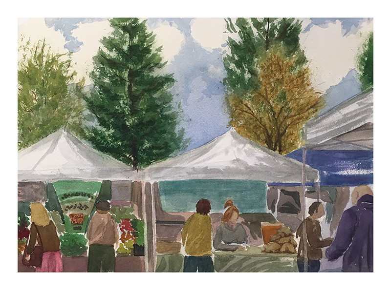
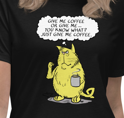
I spent a couple of hours doing some plein air yesterday at a farmer's market. The son of a vendor came over and we had a nice chat about art and he got some free tips (and a pencil!) from me. When I was packing up he confided to me that he could tell I'm a "really good artist". And the reason was: "When most people make art the pencil lines are really dark. But yours are so light you can barely see them." So there you have it - the key to artistry. Avoid dark pencil lines and you're golden! And what's this? A new shirt? Why, so it is!
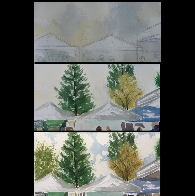
This morning I suddenly realized there's a farmer's market just down the road from me. Why not go paint something over there? Why not indeed! And here's three snapshots of the work in progress. Top pic - just the sketch and underpainting (yellow ochre and cobalt blue). Middle pic - after I've painted a bit, dealt with trees and people and stands and then decided that maybe some sky and cloud action would be nice. And so ... the lowest pic. I negative painted with cobalt blue and lo and behold - a blue sky with puffy clouds! And lest I forget those nice shirts I just uploaded onto my shirt page - here's the latest!
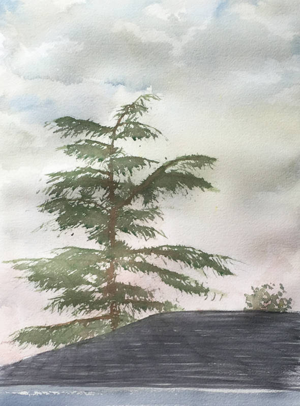
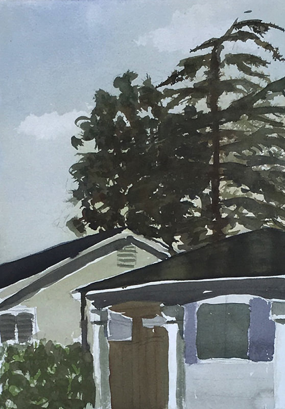
On the painting front, I went out this AM (3rd morning in a row) to do more plein air practice. Wind started to kick up so I had to stop but here's where the painting got to. Was specifically working on sky and the main tree - seeing what effects I could get. AND ... there's a working page now on-site called t-shirts. Took forever but it's finally in a structure that works. I'll be putting my best Tshirt designs up as an ongoing thing starting later today. Whew! Happy it's finally sorted out. I took a while.
Love Julius Katz? Love coffee? Then you're going to love these!
Two days in a row doing a plein air watercolor in the morning. This one took maybe 35 minutes of painting time (and some drying time as well midway). A runnier approach than yesterdays.
How did he DO that? How often have you thought that? Lots of artists are out there doing lots of artsy things and wouldn't it be great to have their various tricks and techniques and approaches in your own bag of tricks, to modify and employ as appropriate? Sure would!
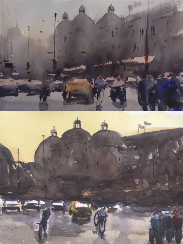
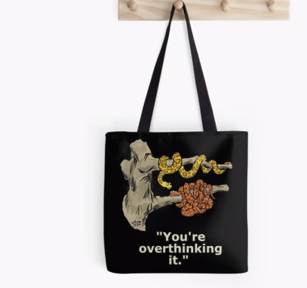
That's what I was focused on yesterday. Alvaro Castagnet has a very loose (my wife says messy) and dark style. Quite impressionistic. Exactly the opposite of how my art style originally developed. Well, to me that means I've got a weakness. I know how to "do" detailed and precise but not loose and free form. Which means it's time to remedy that failing. Yesterday what I did was take a painting of Alvaro's and said to myself "Flip this old painting over and see what you can do on the backside. Try and replicate Alvaro's work." Here's the result. Alvaro on top and Crow on the bottom. I didn't expend much time on my pencil sketch since that went against my "Try and be fast and loose" mission. Hence everything is a bit off in terms of where and how big. But ... did I capture something? I think the answer is a bit of yes and a bit of no. Loose and suggestive - check. But my own painting, taken by itself, has an issue with the three motorcyclists on the right. They're too small for the foreground space they're occupying. Of course, I wasn't really worrying about that then BUT now that it's done I think I should have. Another issue is my background wash. I've got a LOT of yellow in that sky whereas Alvaro's is much more washed out. And his watery and misty look is much watery and misty than mine. Something that's clearly related to the water/pigment ratios and the paper's level of dryness. I know I was quite unhappy with my water mister's performance (and thus stopped using it) and so my paper was definitely on the dry side more than I wanted. Anyway, I'm very happy with the overall experiment and plan to wash and repeat until I feel that I've got a solid sense of "loose and drippy art". And I'll be sure to fill you in on the progress as it happens! The world's best tote bag? That's what I'm told. And today my Redbubble store is donating $1 to climate change for every purchase.
|
Categories
All
|
 RSS Feed
